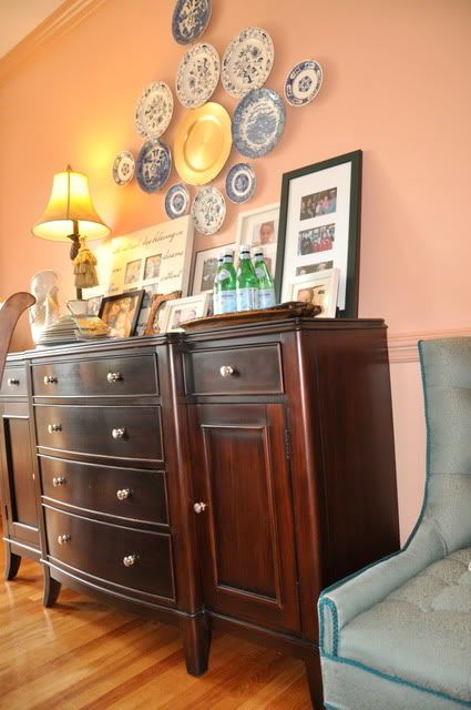
This room was inspired by a photo from Cottage Living which you can see here, and by my love for all things vintage. And the more I live with it, the more I love it. My favorite seat in the room is this comfy chair that I bought at a thrift store for $2 and then had recovered with this wonderful vintage-y blue fabric. Grandmotherly meets hip in this chair. Julia meets Julie.
And today Elea and I meet for a little game of ‘Miss Merry Mac’. I show you this to demonstrate the very flesh-y color of this paint. In this post, I go into pathetic detail about the colors and forbid you to say mauve or peach, so go there for my highly dramatized story of how The Duchess (wall paint) meets the Cowboy (trim paint).
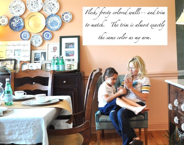
The other side of the room looks like this and from this side, the color appears a little richer.
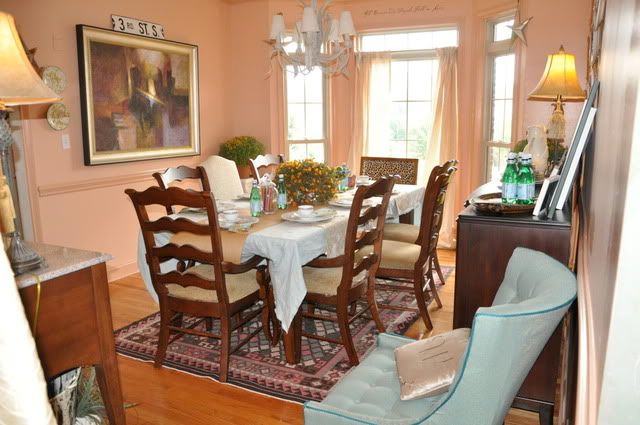
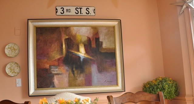
Speaking of truly deepening and adding layers to a paint color, try painting the trim a wee bit darker—but in the same color family–as the wall color. I love the result. It reminds me of an old English study. My favorite ‘find’ for this room is the 3rd St.S. sign that I bought for a steal at a vintage store in Steve’s hometown. It happens to be the street that houses Zion Lutheran Church—where he went to church and school. His Lutheran heritage has changed our lives in dramatic ways which I document here and here. And the sign adds an urban touch to my old English style dining room.
I faced a dilemma with this room due to my beloved ‘wall words’ above the bay window. I apparently loved wall words before they were cool and I happen to ADORE this one, which is the first one I ever bought—-nearly five years ago. Should I just scrape them off and start over? Should I gingerly remove them and try to salvage them? Since I’ve tried that and apparently am not a patient/detail oriented person, I decided to paint over them and retrace them with a black magic marker. If you look closely, it appears that I have an essential tremor or at the very least am 85 years old. I do not and am not. I’m gonna blame it on the fact that it was 12a when I was doing it—-that’s my story, and I’m stickin’ to it.
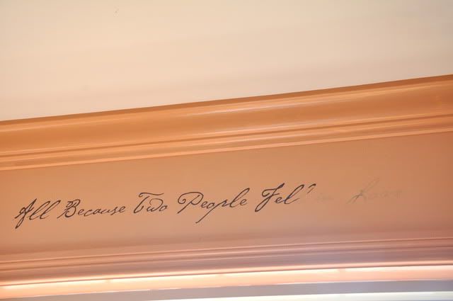
But only someone 7 feet tall would notice that—so I think I’m safe. And my favorite wall words take on a whole new look against the new paint.

The side panels that flanked the window before looked out of place so I’m on the hunt for a beautiful vintage fabric to complete the look. For now, I left the middle panels and the glass stars. I also moved the animal print chair down from Caiti’s room which is officially my 2nd favorite chair in the room.
Next time you have company which involves children, roll some butcher paper over the table cloth and decorate the table with glass containers of colorful crayons and pencils.
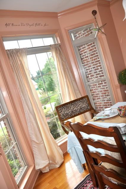
This room has become one of our favorite spots. It’s cozy, colorful, inviting, and very different than every other room in the house. Besides window (mis)treatments, the next project in here—-inspired by my creative neighbor Leigh Ann–is to paint the chandelier. We’re thinking metallic gold but I’d love your suggestions. And we plan to recover or replace the light fixture covers.
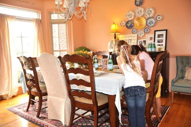
Hope your enjoyed the tour of the newly painted/redecorranged dining room.
Here’s the before/after
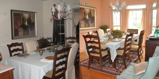
1. Wall paint color—Duchess of Windsor Pink–satin— by Ralph Lauren.
2. Trim color—Coronado Dunes by Behr—semigloss.
3. When using such a bold and seductive color, choose a fully contained room, and seriously consider painting the trim a shade or two darker. It made ALL the difference in this room.
4. To make a room look unique (where you collected pieces over time) and not too decorated, try not to be too matchy-matchy. I love that the plate wall is a little bit different shade of blue than the chair and also different than the blue in the rug.
5. Add pieces of whimsy and natural items to keep the room from feeling too ‘stuffy’ or formal. I like the road sign and the mums and rosemary. The mums can’t stay forever so I may look into little fig trees to go in that spot.


Very pretty!!!
I love the color and the blue plates~
sandy toe
It looks fabulous!!! I can't believe the difference (well, I can actually, paint makes ALL the difference)! I love how you've arranged everything. Beautiful!
Love the before and after, it makes the warmth just so apparent. I can see why you are enjoying this space, and I love the way your home is so beautiful and family oriented at the same time.
I love this room. It is so inviting and warm. I love that you painted over the letters and then went over them with marker–you're so brave!
I'm inspired!
So beautiful Edie… glad you are back! I missed you.
i love it! i love the little picture of you playing mary mac too.
What a gorgeous room. I love everything. The color is just fabulous and I especially like the plates on the wall above the beautiful buffet. Just stunning. Hugs, Marty
Edie, I just love everything about it. What does Steve think? My insticts tell me Lonnie would kill me if I painted a room pink, but if it looked as good as yours he might get over it. Besides, I would tell him it was flesh, not pink! Just fantastic.
I really love that room! IT's very warm and inviting! So, when is the authentic English Tea Party? Complete with crumpets, Earl Grey, and tiny little petite fours?!? I want to come, by the way!
Wow! Your makeover turned out so great! I wouldn't have been sold on the pink, but it looks so fabulous, very homey and warm.
breathtakinginly gorgeous!
Looks so comfy. I really love the mirrored (?) star hanging by the window. I've been looking for one of those and one of those vintagey light fixtures that looks sort of like a 3D star…not sure why I just shared that.
Looks very duchess like! I love it. Are you wiped out or did you have help w/ most of it? You are like the Energizer Bunny I swear!
It looks so warm and inviting. I to just painted my living room wheat, but it rolled on peach and I almost had a heart attack. I love "word" and signs I have them all over. I wanted a red Kitchen Aid for years before they were popular.
Wow! What a beautiful room. I love the paint color and the tone on tone for trim is a great idea.
Decorating the table especially for the kids with butcher paper and crayons is a special touch.
Love all of your fab ideas! Great touch up on the "Wall Quote"! Beautiful color on the walls. Thanks for the tour!
Stay Cozy, Carrie
Looks loverly. 😉
Lovely, I bet it does seem much more inviting than before. Looks fab Edie!
can i come over and have a cuppa tea?
wow! What a difference! I love it!
It's amazing how alive the room looks in the after picture. So beautiful. So you.
Very pretty!
Love the quote!
Rachelle
The room looks AMAZING!!!! I can't believe the difference – the colors are just perfect. You have created a very warm,welcoming cozy space- congratulations!! I love it!
Hi, Edie! Just saw this post & had to tell you how pretty it is. You are fearless with color & I admire that. Love the vintage chair too, this room came together beautifully, it glows!